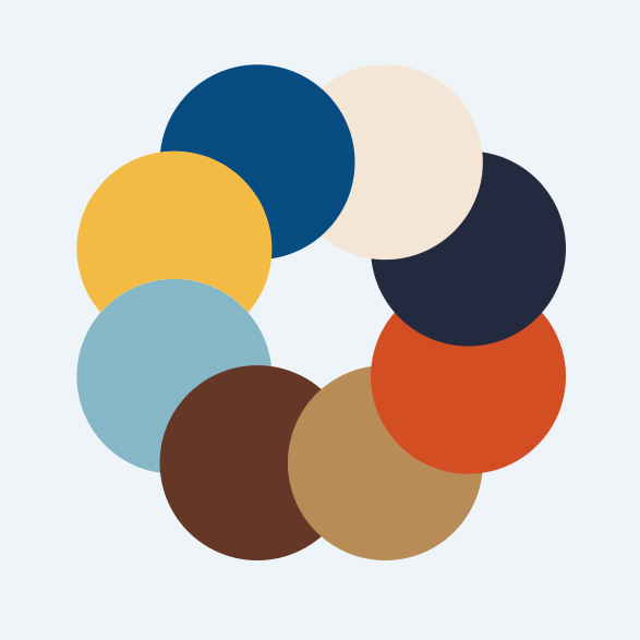
The campaign design is grounded in nine colors, spanning blues, browns, and golds. Each of these colors was pulled from Buttigieg’s life and are named to reflect this. One color is called Calm Blue, reflecting Buttigieg’s tendency to be soft-spoken and unflappable. Another is called Heartland Yellow. The orange is called Rust Belt. Buttigieg’s two dogs, Buddy and Truman, each have their own brown.
[Image: courtesy Hyperakt]In an interactive mood board on the design toolkit website, you can see exactly how these colors came about: You can slide across various photographs from Buttigieg’s world, seeing how they are made up of the nine campaign colors. Some of the images are of Buttigieg at home with his husband, Chasten Buttigieg, while others are of scenes around South Bend, from the factories that have closed to the new tech center that Buttigieg helped build. There are pictures of Buttigieg’s favorite whiskey, Talisker, his shoes, and the watch that Chasten gave him as an engagement present.In other words, rather than shaping the campaign’s colors around what might appeal to Buttigieg’s constituents, Peraza felt it was important to create the most authentic visual representation of Buttigieg himself. “Our position is just that when you’re branding a candidate, the most important thing is to reflect who that person is,” he says. “Lead with that story, rather than focusing on whatever sector or space they’re working within.”
Taken as a whole, the colors have a midwestern flair, calling to mind corn fields and industrial buildings. The colors are also reminiscent of collegiate baseball paraphernalia from the 1950s and 1960s, which often featured browns, yellows, and blues.
Peraza says it makes sense to evoke team sports in the campaign, since it might spur people to rally around Mayor Pete the way they might rally around their favorite team. It’s also true that sports tends to bring people of different political persuasions together. “If you go to the Midwest, sports are everywhere,” says Peraza. “There’s really great design in those meeting places where everybody, regardless of whether you’re blue collar or white collar gets together around a team. We wanted to infuse a little bit of that into this brand, because this is about rallying around a movement, around a campaign. We want you to root for this team.”