Sleepy
Joakim Blom

Care to point it out? I can't find it
Care to point it out? I can't find it
Haha I feel so stupid.
I assume everyone knows about the WSU in this logo, right?
Since people didn't see the mb for a long time, maybe people would miss the wsu.
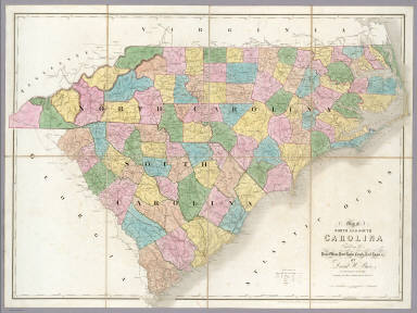
This one is probably more obvious- the map in the Panther's logo.

[/IMG]
To me, that's the biggest stretch ever with a logo. Maybe if you're drunk and squinting into direct sunlight from 50 yards it matches.
Is it intended to be? I have thought that before, but talked myself out of it because it was a reach.
The Panthers logo consists of the head of a snarling Black panther outlined in blue. It is shaped to resemble the combined borders of North and South Carolina.
From their Wikipedia entry