BeachBumDeac
Cheap Date
- Joined
- Mar 17, 2011
- Messages
- 27,804
- Reaction score
- 15,502
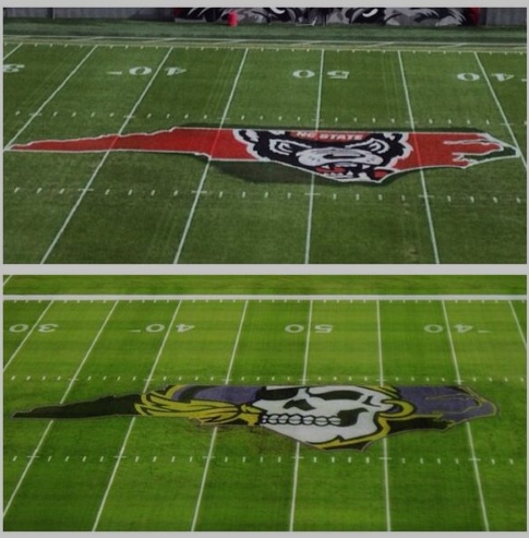
Probably just painting over the previous logo.Seems like they drew SC first or just screwed up. The pirate looks much cooler.
Seems like they drew SC first or just screwed up. The pirate looks much cooler.

Who cares?
that ECU logo has always been bawse. the State one looks lame, especially with the derp wolf and the shadow that defies lighting
So they rip off ECU's midfield logo and LSU's intro video? Creative folks over there
http://mbd.scout.com/mb.aspx?s=178&f=2515&t=11746270&p=1