OblongPickle
Well-known member
- Joined
- Oct 17, 2011
- Messages
- 3,135
- Reaction score
- 593
I can understand that. I just can't connect the shiny gold to the flat gold in our uniforms. They don't match in my mindgrapes. I don't think a gold helmet that is the same color as our uniforms would be terrible. I wish I had photoshop so I could try to mock one up.
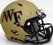
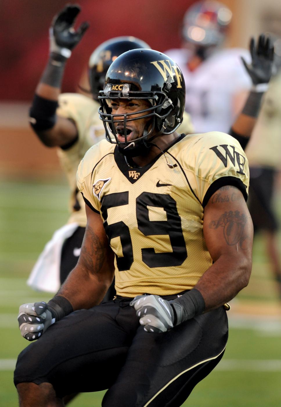
That said, I do like our gold helmets with black logo, but nothing beats the classic black with shiny WF.
Do you guys like the shiny black helmet or the matte black better?
That said, I do like our gold helmets with black logo, but nothing beats the classic black with shiny WF.
Do you guys like the shiny black helmet or the matte black better?