• Welcome to OGBoards 10.0, keep in mind that we will be making LOTS of changes to smooth out the experience here and make it as close as possible functionally to the old software, but feel free to drop suggestions or requests in the Tech Support subforum!

Petition 4 Wake Forest Football Helmet Logo

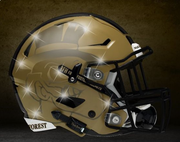
If they want to get crazy 1 game a year, I'm all for it. But I love the helmets we have, especially the gold ones.
 
Love the throwback Dooley era helmet.

Also, we gotta step up our "we look good and thus play good" game now that we are a top 15 program!
 
Screen_Shot_2018_09_16_at_10.59.59_PM.png


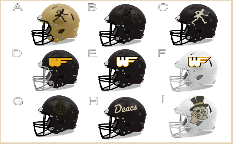
From a 2018 BSD article. I would love to see A, C, or H make an appearance one time.

I like the skinny deacon in A and C (obviously). The flying WF is trash whether it is a throw back or modernized. I'm ok with the deacon head. The script is horrible.
 
It's not 1950, it's 2022. No school should have a big white face as their logo. Maybe an exception for George Washington Univ. I hated the white face on our basketball court. Luckily it's gone and the court looks so much better. The skinny Deac is not bad though.
 
An angry religious figure is a weird mascot in 2022.

Our helmets are pretty close to perfect already. Same with the unis. I don’t see a need to mess with what works.
 
Agreed. I sorta like 'E' above, and sorta liked the script 'Deacs', but immediately thought it looked like Duke as well. The skinny Deacons look terrible and would not show up well on helmets I don't think. I like the look of the White helmet with the Deacon head, but it would not go good with our uniforms unless we went all white, or just white tops with black pants.

I think we are good with what we have.
 
The skinny Deacon is the most excessively marching character in any logo on earth. We're the Demon Deacons not the Marching Deacons.
 
Prefer helmet with the name: Wake Forest.
With TV close ups today it is very visible on the monitors.
 
I think each helmet should have the player's face on it. Alabama's helmets have the player's number on them; so this is just one step further. It could also be a big deal with NIL.
 
I think each helmet should have the player's face on it. Alabama's helmets have the player's number on them; so this is just one step further. It could also be a big deal with NIL.

How about a QR code to links to their social media and NIL agent’s website?
 
I think each helmet should have the player's face on it. Alabama's helmets have the player's number on them; so this is just one step further. It could also be a big deal with NIL.

We had the player numbers on our helmets under Dooley

I'm not opposed to the flying WF making a comeback for one game, and I think the Deacon head would be cool too in the same regard, though not on a white helmet, and not with an oversized head. Like the same size as the Baylor cubby bear helmets. It's too big on the above helmet.

The marching Deac is ok, except that a lanky stick figure doesn't exactly scream football. The university logo is horrible, whether it's black on black or not. Deacs in any kind of script is kind of pointless.
 
Completely agree about the marching (or do we call it the strutting) Deac. Wake isn’t well known enough for our internal traditions to be instantly recognizable to the public. Sticking with the WF logo and brand works best.
 
Completely agree about the marching (or do we call it the strutting) Deac. Wake isn’t well known enough for our internal traditions to be instantly recognizable to the public. Sticking with the WF logo and brand works best.

And rather than confuse WF with Waffle House just emblazon Wake Forest, or Wake which links up with the crawler on the monitor. But I prefer Wake Forest. Keep repeating the same message in sales.
 
And rather than confuse WF with Waffle House just emblazon Wake Forest, or Wake which links up with the crawler on the monitor. But I prefer Wake Forest. Keep repeating the same message in sales.

I noticed recently that the ACCN and ESPN bottomline crawler has gone to the full length "Wake Forest."
 
Completely agree about the marching (or do we call it the strutting) Deac. Wake isn’t well known enough for our internal traditions to be instantly recognizable to the public. Sticking with the WF logo and brand works best.

Where the marching/strutting Deac would look good is on the side of some basketball shorts. You usually have a split down there at the bottom of the shorts on the side anyway. Just use the Deac to accent it. It would be subtle, Wake-appropriate, plus people might think we put a fucked up Jordan jumpman on there. Our basketball uniforms are in need of a drastic overhaul anyway, so it's something to think about.
 
And rather than confuse WF with Waffle House just emblazon Wake Forest, or Wake which links up with the crawler on the monitor. But I prefer Wake Forest. Keep repeating the same message in sales.

I'm with on the "keep repeating one message" as the best way to increase awareness of the Wake Forest brand.

Also, I am NOT a fan of the fat letter font "W" in the the WF logo helmets. Looks like a distillation flask at the top and a fat butt at the bottom.
 
We need font consistency between our WF helmet and WAKE football jersey. I know it's a Nike thing but they find ways to ruin things by making them too busy. The helmet font should be used throughout the uniform.
 
Found this one online...I don't mind it so much:

(Click image for larger version):


EDIT: I also wouldn't mind a matte gold helmet with black/white WF like this:

a9a3e97b-d9d8-4be2-970e-fd3b6a75e1ae-v_helmet.png
 
Last edited:
Shiny gold only please. No Dijon mustard Georgia tech helmets for me
 
Back
Top