BeachBumDeac
Cheap Date
- Joined
- Mar 17, 2011
- Messages
- 27,664
- Reaction score
- 15,256
I missed this when it was announced. WTF is that hole?

WHAT. IS. THAT.
That’s a toilet

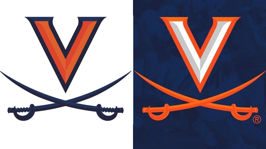
So if they just hadn't said when the new logos were announced back in April that the new design was intended to look like the serpentine walls, the logos would've been ok? It's not like sword handles with grips have a closer connection to slavery than smooth sword handles.
So...it’s the serpentine grip on the handle that evoked the campus wall architecture related to slavery?
Now the grips are smooth...?
Old on left, new on right.
Link.