CDeacMan
Ishmael Smith
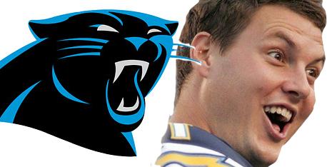
When I first looked at the logo, I felt like the right eye was smaller and because it had the color surrounding it, it looked like it was swollen like the Panther took a right hook to the face.
Whatever, I guess it's fine. Don't think it was necessary, but that's Nike for you. Personally I liked the old lettering better though.
Whatever, I guess it's fine. Don't think it was necessary, but that's Nike for you. Personally I liked the old lettering better though.