• Welcome to OGBoards 10.0, keep in mind that we will be making LOTS of changes to smooth out the experience here and make it as close as possible functionally to the old software, but feel free to drop suggestions or requests in the Tech Support subforum!

New Panthers logo

I think it looks great. People get paid to do it because they are good enough to know when a total overhaul will ruin the logo.
 
panthers.png


For those of you who can't see it. Ideally it would have been rotated another 30 degrees or so, but MSPaint is limited.

A nice improvement. The new font is meh, but anything is an improvement over the old 1990s claw slash font.
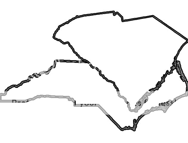
That looks nothing like NC.
 
A
new-carolina-panthers-logo1.png


B
old-carolina-panthers-logo.png


Which one looks "More Aggressive?"
 
That looks nothing like NC.

If they wanted it to look exactly like NC, it wouldn't look like a panther. Thus, the representation is abstract.

If you can envision SC being an equilateral triangle, and NC being an obtuse triangle sitting on top of it, then it works.
 
You guys are making it too complex. I worked in Charlotte TV at the time of the formation of the panthers. WBTV Panther's show way to long ago. They did make the logo off of the shape of NC and SC. All you really have to do though is tilt the logo from left to right about 30 degrees and it's close to the shape of NC/SC as they show on a map.
 
You guys are making it too complex. I worked in Charlotte TV at the time of the formation of the panthers. WBTV Panther's show way to long ago. They did make the logo off of the shape of NC and SC. All you really have to do though is tilt the logo from left to right about 30 degrees and it's close to the shape of NC/SC as they show on a map.

This and the stacking were the two I thought they might be going for.
 
If they wanted it to look exactly like NC, it wouldn't look like a panther. Thus, the representation is abstract.

If you can envision SC being an equilateral triangle, and NC being an obtuse triangle sitting on top of it, then it works.

No, I mean it doesn't even look like a rendition. The tilting thing makes way more sense than flipping up side down and rotating.
 
A, Absolutely.

Meh. Old one has more much more agressive eyes and mouth. Looks like it might actually be roaring/growling, whereas the new one has a blank-eye'd sleepy yawn going on.
 
They shouldn't have ever acknowledged SC anyway, but they didn't ask my opinion. What is wrong with the Charlotte Panthers?
 
You guys are making it too complex. I worked in Charlotte TV at the time of the formation of the panthers. WBTV Panther's show way to long ago. They did make the logo off of the shape of NC and SC. All you really have to do though is tilt the logo from left to right about 30 degrees and it's close to the shape of NC/SC as they show on a map.

This. Thanks for the sanity check.

LMAO at the upside down logo with the cities shown.
 
I just don't like their ugly-azz colors. Real men don't wear electric blue, except this dude who is probably a bawse:
stripesbluehat-2.jpg


Only the Jaguars have uglier colors in the NFL.
 
I like the "update." I mean, it wasn't necessary at all but I think if they had to change it, I like what they did.
 
No, I mean it doesn't even look like a rendition. The tilting thing makes way more sense than flipping up side down and rotating.

It wasn't flipped, it was rotated 180 degrees, just one transformation. The tilting thing doesn't look anywhere close imho. I've yet to see a convincing illustration of any other method that looks any better than what i posted above
 
FU. the Dolphins are bawse. and who doesn't like a dolphin wearing a football helmet?

haha yeah I'm surprised the dolphins haven't changed their logo. When your logo's original artist was norman rockwell it might be time for a revamp
 
Back
Top